Layman’s Take-Gravity got updated to v2.70 Build 7153 Finally

Update: @Janole has released a new update that is v2.7 Build 7153. Download link

Do you know what was the last time when Gravity got its last update? It was March 08, 2012 means exactly two and half a month before. Not exactly the longest period between two successive Gravity updates but still it was quite a long gap and people like me who been following Gravity updates since long, knew that longer period between successive updates always been leading to some great new features. So let’s see what new features are on card this time?

Scr000361Scr000382

Before starting to talk anything about it, let me warn you, this time this update is a real Alpha means a premature build and you must be ready for some bugs while trying it (though like always, I didn’t found many of show-stopping kind of bugs).

Gravity

So, are you ready for a walkthrough of new features? Here we go.

The changes that I might have noticed till now are as given below:

1. All New Notification Bar and removal of Full Screen Mode: Many of us liked Gravity in the full screen mode always but this was a big dilemma for people since the Belle update came in with drop down System notification bar. Being in Gravity timeline with full screen mode was meant to miss the status bar altogether.

Scr000380Scr000384Scr000376Scr000266 

@Janole decided in favour of removing the full screen mode (as was in earlier version, showing in extreme right screenshot) and introducing an all new notification bar with three sections.

  • An either blank or Home icon that will take you back to all accounts screen.
  • The middle part of status bar will take you to the top or to Dashboard of particular account.
  • The brand new notifications section that will take you to notifications + last visited history section.

For me, the issues in this approach is, Gravity has an option to tap on top to move to top of the timeline and with two status bars (One of system and one of Gravity), it becomes a lot confusing. You have to hit the status bar precisely to get to top because if you hit top most system bar then it might be lead to system drop down that might annoy you. Moreover, the pixel size of the new Status bar is almost doubled means loss of screen space on already low resolution Symbian screens. I think @Janole also agree on it.

Rollback 

All I can say that this approach might be good for many but may annoy many as well. In my opinion, there should be a full screen mode option present and in that mode, the pixel size of the status bar might be lowered as well. Though I wont push more for the pixel part because status bar needs to be in the same size as the search bar to cover it up in other parts of UI.

RFollback

One of the workaround might be an Auto-Hide search bar along with half the pixel status bar in full screen mode. But let’s see how @Janole will deal with it.

586679925

But the better side of this exercise is, you now have access to drop down toolbar, signal, battery, time and system notifications etc.

* Thanks to @HardikLive for some of the screenshots.

2. New Add Account section with a minor change: Not a big change but one may spot a little change in Add Accounts section, where we find two options for Twitter account.

Scr000268Scr000381

The “Can’t add a Twitter Account?” section is to bring back the old OAuth part for adding a twitter account without going to Twitter website because many a people faced issues via web route. Obviously for getting DMs, you will be needed to authorize via web only if you choose this choice.

3. The Search bar on the top of Twitter/ Facebook section: This is one of the experiments that even @Janole wasn’t sure and delayed it since January even after early implementation because it certainly takes its sweet time to get used to of it.

Scr000370Scr000386586681612

Only issue might be the screen real estate taken by it, but over the time, people will sure start getting used to it. Thing is, we are so accommodated to traditional UI elements of Gravity that any such change feels awkward in the start.

4. The notifications + History Section: The introduction of brand new Notifications section brings you a single place where you can keep track of notifications and history of the last visited places inside the app.

Scr000375Scr000389

Not only that but @Janole has planned to make it even bigger in next updates.

Future1

5. Anna-Belle type rounded icons across the UI: I am not sure that why it wasn’t here already in last update but finally the native looking icons are here to make the experience consistent throughout the OS.

Scr000373Scr000390

6. Facelift for Groups and Lists Section for Twitter: Groups and Lists section which was just a list earlier now gets the much needed grouping/

Scr000379

Isn’t it look good enough now.

7. User profile shows if the user following you: The new user profile section in twitter now shows that if the user is following you. So no more, tapping on profile and check if Direct Message option is appearing or not.

user

8. Image save option in Facebook section as well: It was already there in twitter section via tap on the picture or tap on the button in the middle bottom and it was about time, when it makes to Facebook section and its here now.

Scr000388

One difference here is the absence of the bottom middle button for saving the image but as the place was already taken by Edit button, @janole left it to tap on the picture to save it.

9. Facelift in Foursquare section, comments notifications: Not much significant, but the foursquare section also have got some minor changes in the way a check-in looks or in the way you search for a place.

oldNewNew1

The left most screenshot is from old Gravity while the middle one is from new one. You can spot the changes. Also the search bar in top is a new introduction. Also now you will get notifications when someone comments on your check in.

Though still we don’t have emphasis on marking system as in Foursquare and it doesn’t notify you that how much last checkin earned for you or where you stand in leader board.

10. New share menu in Gravity: Though as of now, it works only for the links in Browser, Facebook and Google reader section, but finally we have a share menu in Gravity that serves the purpose of saving articles/web pages from one social network to another.

Scr000366Scr000387

Also now you can edit the title before sharing it in Google Reader menu (share function was there earlier). Though with this share menu, @Janole hasn’t integrated the is.gd or any other url shortener, but may be its for good, because who wants his/her URL getting shrink three times while posting? Twitter already has t.co while Facebook treats URLs other way.

As expected, introduction of Share option means no Tweet it button in Google Reader section anymore.

11. Gravity Browser gets attention again: Since the implementation, Gravity browser seen very less visible changes, but the big update this time decided not to leave it.

123

The first change is change of share icon that comes back to Symbian style iOS style as earlier and also Readability support for formatting the webpages for mobile screens.

While its a good step in right direction, it has its own share of glitches.

First, its rather annoying to get it back from Full screen mode which it choose automatically once open, then if you tap and hold you finger for 2-3 seconds, then bars appear but they get away once you remove the finger. It should stay for long so that one may come out from browser easily.

Second, Readability support is only for formatting the page, not for using you Readability account as Gravity browser still doesn’t support cookies means no kind of logins can be supported.

Readitlater

Actually this was a feature suggested to @janole long back in 2009 itself which finally got delivered by this new version.

12. Last but not least, option to share status on multiple networks finally: Yeah! finally you can share the same status on multiple social network accounts at once (facebook\Twitter}. All you need to do is to swipe your finger from left to right or right to left on Add Account section and you will get the screen given below:

share

This was a much needed and heavily requested feature since long. Thanks to @jryap28 for bringing this into my notice

13. Picture size shown while uploading photo to Twitter: As told by @janole, this was actually a debugging feature, but he found it rather useful for public as well and released it with this version.

size

Though its available for Twitter section only and not available in Facebook section as of now. But should come shortly with new version.


Bug: As of now, Gravity has two of the known bugs with this new version.

  1. Push Notifications or User Streams broken Fixed with 7153
  2. UI issues with Swype split screen mode Fixed with 7153

Hope that it would be sorted by the upcoming version in next 2-3 days. Already out as build 7153.


So, this was all that I spotted about the new Gravity and now its your turn to tell me if I would have missed anything. Also this time, @Janole has made some important comments about the future of Gravity that you must not miss.

Future

It says the long awaited Picasa (May be even Flickr Integration) might not be too far and may be a complete makeover of Images section may arrive with our long awaited Symbian Imaging Flagship Nokia Pureview 808.

Biggest

Gravity11

And then the biggest announcement that might bring back many a hopes and smile on faces of people who have left Symbian and missing Gravity very much though @janole has cleared further than no work on Android\iOS right now. Schedule for second half or late of this year.


So this was what I had to say, now its your turn. Download it from here http://bit.ly/7152ALL and comment here if you find any more changes in it or wanna suggest something. Also keep a note of the fact that its a preview version so many a things might get changed in the version that will come shortly.

preview

Proporta Turbocharger 5000–[An Essential Accessory to have]

I am not sure that I ever would have reviewed a product and would have rated it as “An Essential Accessory” but there is always a first and for me, it happened to be Proporta USB Turbocharger.

Smartphones and their battery life, something most of the users talk about, bitch about many a times because of the simple fact of life, if your phone is out of battery, then there is no difference between a 7mm thick phone and a 17mm thick one. But still the temptation of owning a slim phone is something that neither manufacturers nor users are giving up.

Its not that manufacturers and users are not trying for the solutions/workarounds and its definitely not the case that you can’t do anything about it.There are two ways to deal with it; spare batteries and portable chargers. Lets discuss both a little.


Issues with spare batteries

The regular readers here would not have missed my review about Mugen Batteries in past and the friends on Twitter and real life would have seen that how those batteries remained an integral part of my daily routines (and some of the regular issues). As time passes by, you learn about some of the limitations around these extra-power/replacement batteries, like the ones given below:

1. NO HOT SWAPPING: If you are running out of battery then you need to remove that battery and use the spare battery. Obviously, this involves switching off your phone for once even if for half a min only.

2. Battery Calibration: With the spare battery solution, you get two types of spare batteries; either of same power (mAH) or of extra power (more juice). The issue is, most of the time, the underlying OS is not that smart to handle this and you need to calibrate the batteries (many a times, its 2-3 cycles means 2-3 days long process) otherwise you wont be able to take full advantage of the juice that these batteries can provide to you. Obviously a cumbersome thing for the n00bs and for even geeks.

3. The size & shape: Love it or hate it, most of the Smartphone manufacturers nowadays feel like flaunting the slimness of their phones rather than caring for the fact that how much long the “slim” battery lasts for the user. For overcoming the issue, the user either has to use his device less or have to carry a charger with him all the time or have to opt for a thick battery for him that obviously negates the first cause that was slimness. Truth is, people don’t prefer to show their phones as thick stabs.

4. No separate charging: A spare battery can not be charged in separate, it has to be in device for getting charged. Means if you are preparing for some trip, then you first charge your first battery, then you pull out the battery and then charge the other one. Obviously a big amount of time required and when you put it on a scale of daily routine, then it becomes a mess.

5. Multi-usability: The issue with spare batteries, is their being specific for one handset. The smart users who need such things are actually carrying more than one devices with them and not only that but also changing the devices by each year. Is it wise to keep on purchasing spare batteries for each of the device?

6. Price: As of now, if you buy a separate same capacity spare battery then the price remains reasonable but due to the type of tech involved in high capacity batteries, the price remains an issue in the later case. It might be as worse as 4-5 times higher than the stock battery price.


How I got introduced to Proporta?

After going through the first solution in detail, I decided to give the second option a try; the portable chargers like the one I seen in hands of @SamDLaw first (that was a Nokia DC-11 1500 mAh). 1500 mAh was not enough for me, so I was to look for other solutions and the biggest name I heard of in twitterverse was of Proporta; An expert in field of mobile phone accessories, cases and portable chargers.

As it was mostly an online store and there was no way to get it from some nearby store in India, I wrote back to Proporta about my interest in Proporta Turbocharger 7000 and for my surprise, after a few days later, a sweet conversation with Jitender @ Proporta led to a review unit of Proporta Turbocharger 5000 for me (as Turbocharger 7000 was out of stock for the moment).

Proporta TurboCharger 5000: The Unboxing

2012-05-07-024

The wait didn’t took long and within days, I got a call from security of my office that “Sir! you got an Air Mail” and the well packaged accessory was in my hands.

Continue reading “Proporta Turbocharger 5000–[An Essential Accessory to have]”

Layman’s Take on Nokia Asha 303–Loaded enough?

It might be a tough job for a blogger to review one of the Asha handset. Blame our own habits which are addicted to high end. But if one looks at Asha Series out of this Metro City Blogger mind set, then less chances to find it dull, in terms of the value it adds to the feature phone market that is still going steady and strong (even if we don’t feel that way on twitterverse or blogs).

While in the last review, I talked about Nokia Asha 300, now it is the time to talk about the real leader of the pack, Nokia Asha 303: One of the phones, over which Nokia thought to pull it back with low end handsets in Indian market. Let’s see how it is….

DSC05152

Nokia Asha 303 is finally the one to showcase a capacitive screen on S40 Touch and Type genre along with the honour of being a Nokia Touch-n-Type QWERTY at such low price point. In many ways, this seems to be the Nokia Asha handset which should have started the Asha Touch-n-Type Series in first place.

Continue reading “Layman’s Take on Nokia Asha 303–Loaded enough?”

Layman’s Take on Nokia Asha 300–Ray of hope for cheap phones?

May be you might not have given much weight to Asha series phones when Nokia announced them for the first time, but considering their response with people and kind of features they put on offer with ultra low price tag, it’s hard to ignore them. So, I am breaking my silence again with a Layman’s Take on Nokia Asha 300.

The review coming a bit late as after launch of Nokia Asha 302, I was a little confused if people wanna know about its older cousin Nokia Asha 300 or not, but after receiving a few queries on it, I thought to post it finally. 

There was a time, when for India, a low end mobile phone was meant to be Nokia only and then with the arrival of cheap dual SIM phones things kept on changing. Nokia was needed to spice up the things on the loyalty of their buyers, built in years based on legendary signal/ battery performance of their buyers and that’s where Asha Series phones stepped in.

With Nokia Asha Series, the first big decision was the inclusion of 1GHz processor for the handsets which were supposed to be sold at 100$ -150$ and the second was revamp of their S40 operating system to support the bigger processor and also to include the support for Touch-n-Type segment. With customizable home screen and a much richer application store, Nokia wants to keep their loyal low end user base content with them, let’s see how it goes.


Nokia Asha 300: The content inside the box

I knew that Nokia Asha 300 has USB OTG feature, but obviously considering the price tag, I wasn’t expecting that Nokia will manage to include one USB OTG cable inside, but for my surprise, they didn’t even include a MicroUSB cable too this time. Yes! we are in for a very very minimal content inside the box without the traditional MicroUSB cable even.

2012-03-04-053

Continue reading “Layman’s Take on Nokia Asha 300–Ray of hope for cheap phones?”

Hands on over Nokia Pureview 808–Layman’s Take

Yeah! It would be one of the rarest occasions when I might be posting about just a hands on, but a hands on over a Smart phone having 41mp camera in it, is rare of rarest in itself. it was hard to keep the excitement within and I know you wanted to listen from me about it…

2012-04-10-125

It started from an invite from Aditya (@adityavnathan) about a Nokia Reviewers workshop in Hotel Oberai, New Delhi for April 10, 2012, with Vesa Jutila, Head of Symbian Smartphones Product Marketing, Smart Devices at Nokia.

While the name of Vesa Jutila was a hint in itself, I was already hinted that it’s about Nokia Pureview 808.

I knew that Tuesday will be a weekday and it wont be easy to bunk the newly joined office in middle, but when it’s about Nokia Pureview 808, it was hard to stop someone who been proud owner of Nokia N82 and Nokia N8-00 and there I was and some other blogger friends….

2012-04-10-124DSC04986

Apparently its not the first event related to Nokia Pureview 808 in India as Dolby event in Mumbai (mid March) happens to showcase it first, though this should be the first official event related to Nokia Pureview 808 in India from Nokia itself. Delhi took the first spot, Mumbai will be next for Wednesday event.

Continue reading “Hands on over Nokia Pureview 808–Layman’s Take”

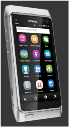
Layman’s Take on fMobi–Finally a Facebook Client getting the things right

It rarely happens that I write a Layman’s Take on a Symbian App, barring Gravity posts, but when I was checking out the latest fMobi version 2.5, then it certainly felt worth mentioning and we are here, reviewing fMobi 2.5 that is being called as the best Facebook client out there for Symbian.

While Official Nokia Social app been already a pain for Symbian users, more tragic was the absence of official apps from Twitter/Facebook like popular social services. Adding more insult to injury was the web browser part that never got a preferred treatment from these services despite of having Symbian in market leading position for a time. Part of the blame goes to tedious development with conventional C++ that was always a tough job for developers due to rapid changes across interfaces\features of social sites. With Qt though, Symbian got a sigh  of relief and out of many apps getting benefitted from it, one was our fMobi.

Scr000168N8_fMobi2_

fMobi: First released on 05 July, 2011 (not sure of exact date), the Qt-Based Facebook client fMobi kept on growing its fan-base by each passing day due to plenty of features combined at one place with a smooth working UI (Thanks to Qt). You can understand the level of popularity by the fact that It didn’t took even three months, when it got acclaimed as best Facebook Client for Symbian by Nokia itself.

Its not that I didn’t noticed it then, but somehow it was features like shaky split screen input etc (not a fault of app itself but Qt version issues) that kept me away from embracing it fully rather than relying on some other apps, but this fighter app didn’t gave up and kept on luring me time to time with each update. And when I checked out the latest version 2.5, then I was like.. this is the right time, when the app deserves a mention like a Layman’s Take on fMobi.

What makes fMobi special and superior over other clients out there?

The keywords are innovation and consistency which makes fMobi always one step up ahead of the competition. fMobi chooses a different UI and mannerism than the official apps and yet delivers an experience that brings you best of Facebook activities. Being in latest Qt, its smoothness/animations in various actions, native split screen integration and its own way to notification will sure please any Symbian user.

it might not be free like some of the Facebook clients out there, but the way, this is being developed and being enhanced in each iteration, I couldn’t even compare it with any of the existing clients out there (when there is no real official Facebook client there and Nokia Social is kind of no challenge since always). A few things certainly worth the price (Just Rs. 50/-).


Continue reading “Layman’s Take on fMobi–Finally a Facebook Client getting the things right”

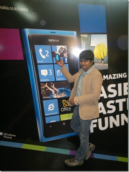
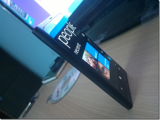
Layman’s Take on Nokia Lumia 800- Take a look over it without shadows of anything

[tweetmeme source=”nkumar_” service=”is.gd” hide_in_rss=”true” only_single=”false”]

Last November been a really eventful month for me (though apparently less eventful for my blog posts themselves) as after BlackBerry Touch 9860 and Nokia N9, Nokia Lumia 800 also joined in the list of review devices to me. But then Its not been only tough schedules but also the entirely new product experience that made me delay in posting my first impressions (though I always been vocal on my twitter account @nkumar_ in this while) like I did in case of big devices like Samsung Galaxy S or Nokia N9 in past.

It was necessary to get over with the excitements/ pre-judgments first before writing a Layman’s Take about it. So,… here I am. Back again after the longest period taken with any of other review device to me in past.

2011-12-10-126

Since we heard of leaks about Nokia SeaRay, this handset (now known as Nokia Lumia 800) always been overshadowed by the adjective Nokia N9 look-a-like and that really been a lot injustice to this brilliant piece of design. Think if there was no Nokia N9 and Nokia would have came out with this iconic design as their first Windows Phone? Shouldn’t we judge this device in that way only?

Nokia: Symbian –> Windows phone

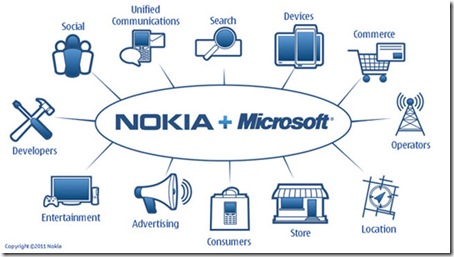
Since the Burning Platform Memo, there been a lot of debate around Nokia’s shift to Windows Phone. Like any heated discussion, there will always be some pros and cons of any move on such a big scale, but the thing is, we should accept the reality now that Nokia is a business company and they are here for business. When a new CEO got hired and was expected to do a turn-around (with probably not that many easy options around as many of us might have thought in early emotions of #Feb11), then considering the reputation of in-house software in eyes of major operators, we can see a point here in choosing Windows Phone as viable alternative.

Many called Stephen Elop a Trojan Horse since his joining as Nokia CEO in October 2010 and speculations around his shares in Microsoft kept on fueling the doubts until he sold those shares and bought Nokia’s shares. But in all those speculations, people missed one thing to notice. Even if he would have been a Trojan, even if he had plans of a Nokia-Microsoft deal since the beginning, was this really that easy to convince whole Nokia to go Microsoft way from day one? Making a Windows Phone from day one? Think practical. How much time Nokia Lumia 800 got in R&D labs? Not even an year.

Me and you may not understand that how hard it might have been, but ask the manufacturers and experts that how hard it is to actually deliver a product in market in this short span of time? Even if you write off the design as that of Nokia N9 plainly, it’s a totally different OS and related interfaces beneath and testing of components follow a standard process that is sure a time taking one.

nokia-windows-phone7_2

You have to admit the remarkable work that is personified as Nokia Lumia 800 today, one totally distinct design standing apart from whole world of suing and counter-suing. When you think of situations around it then Its just not a design or just another phone, but its something even bigger than that.


Windows Phone and me

Believe it or not, its been the first ever Windows phone for me as I never had a brief hands on over Windows phone in past. So, what I am gonna write here, will be raw impressions for a first timer. I would be someone who is coming from a Nokia device background and being a Samsung Galaxy S owner, can weigh its pros & cons in comparison to other available alternative that is Android.

2011-12-02-048

Its not only interesting for you, but its been interesting for me as well and so I decided to give it enough time before writing something about  it (After all, I been given a generous two months review period for the device). And now it would be one of the biggest text based walkthrough of Windows Phone Software till date.

Continue reading “Layman’s Take on Nokia Lumia 800- Take a look over it without shadows of anything”